Nobody reads a website the way they read a book. They don’t start at the top, work through it methodically, and form a considered opinion at the end. They land on a page, take in an impression in the first few seconds that’s mostly visual and emotional, and either stay or leave based on that impression before they’ve consciously processed much at all.
This is not a theory. It’s how the brain works under conditions of uncertainty, which is exactly the condition a new customer is in when they land on your site for the first time.
For a gym, a cafe, or a spa — businesses where the experience is the product — this matters more than in almost any other category. You’re not just selling a service. You’re selling a feeling. And the website either delivers that feeling in the first three seconds or it doesn’t.
The Three-Second Verdict
Research into how people process websites has consistently found that visual impressions form within 50 milliseconds — faster than a conscious thought. By three seconds, most visitors have already decided whether the site feels credible and whether it’s worth their attention.
This happens before they’ve read a headline, before they know your prices, before they’ve seen your reviews. It’s entirely based on visual perception: how the page looks, how fast it loaded, whether the layout felt organized or cluttered, whether the photography conveyed quality or felt generic.
The three-second verdict isn’t rational. It’s the brain running a pattern-recognition shortcut built on thousands of prior experiences with websites, businesses, and visual environments. A site that pattern-matches to “professional, trustworthy, high quality” gets the benefit of the doubt. A site that pattern-matches to “outdated, cheap, careless” starts in a hole that the rest of the content has to dig out of — and most of the time, it doesn’t.
The implication for gyms, cafes, and spas is direct: the investment in how the site looks and feels is not aesthetic vanity. It’s the mechanism by which you earn the next ten seconds of someone’s attention.
What the Brain Actually Decides
The three-second window isn’t just about aesthetics. It’s about trust calibration.
When a new visitor lands on your site, their brain is running a rapid assessment: does this business look like it will deliver what I’m hoping for? Is this a place I can trust with my time, my money, my body, my experience?
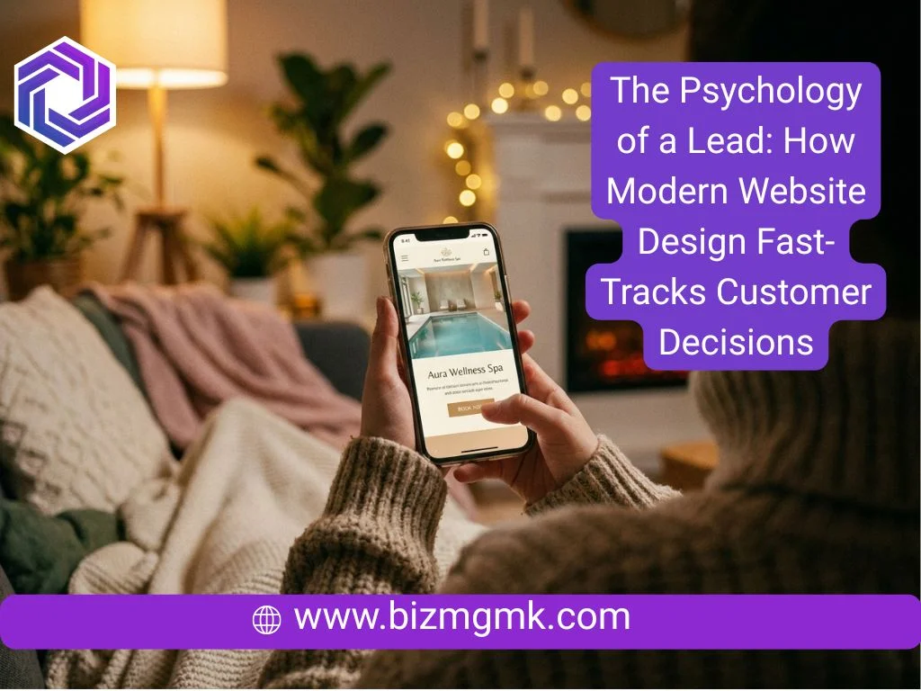
For a spa, that assessment is heavily weighted toward sensory signals. Does the site feel calm? Does the photography suggest a quality environment? Does the color palette feel considered or random? A spa website that’s cluttered, fast-moving, and visually loud contradicts everything the customer is hoping the spa itself will be. The site and the experience need to feel like the same thing.
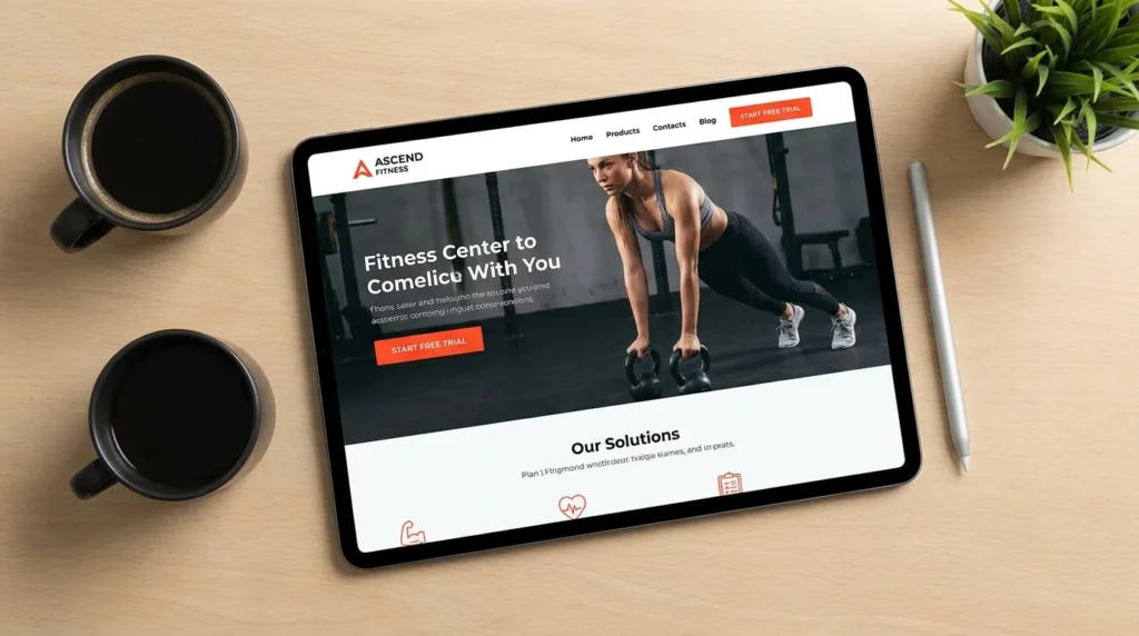
For a gym, the assessment is about energy and credibility. Does this look like a place that takes fitness seriously? Are the people in the photos real members or obviously stock models? Does the site feel current and active, or does it look like it was built by someone who also did the accounting?
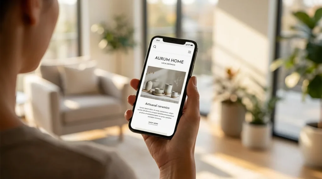
For a cafe, it’s appetite and atmosphere. Does this look like somewhere worth going? Does the food photography make me want to eat it? Does the vibe of the site match the kind of experience I’m hoping for — a quick coffee or a long lunch, somewhere buzzy or somewhere quiet?
These assessments happen below the level of conscious reasoning. What the visitor experiences is not a checklist — it’s a feeling. The feeling either says “yes, this is for me” or it doesn’t.
How Speed Triggers Trust or Doubt
Load time is part of the first impression whether most people think of it that way or not.
A site that takes five seconds to appear creates a moment of uncertainty before anything visual has even loaded. The blank screen or partial render is the first thing the customer sees, and the brain interprets delay as a signal. Slow equals unreliable. Slow equals not worth waiting for. It’s not a fair association, but it’s the one that gets made.
Google’s research found that as page load time increases from one second to three seconds, the probability of a visitor bouncing increases by 32%. From one second to five seconds, it increases by 90%. These are not marginal losses. At five seconds you’ve lost nearly half the people who came to your site before they’ve seen a single thing about your business.
For gyms, cafes, and spas competing in local markets where several credible options exist, this is a direct competitive disadvantage. A potential member or customer who leaves your site before it loads goes to the next result. If that site loads in two seconds and looks good, you’ve lost them before you had a chance.
Speed is also part of how the site feels to use once it has loaded. Pages that transition smoothly, images that don’t pop in after a delay, buttons that respond instantly — these micro-experiences accumulate into a sense of quality. A site that feels sluggish feels like a business that doesn’t invest in the details. Which makes a customer wonder what else doesn’t get the attention it deserves.
Visual Hierarchy and Why It Guides Decisions
Visual hierarchy is the design principle that determines where the eye goes first, second, and third on a page. It’s not accidental — it’s engineered. And it’s one of the most powerful tools a website has for guiding a visitor toward a decision.
The eye moves toward size, contrast, and position before it moves toward content. A large headline in a high-contrast color gets read before a smaller one in a lighter shade, regardless of which one is more important to you. An image placed in the top left of the screen gets noticed before an image placed lower right. White space around an element draws attention to it; clutter around an element obscures it.
Good visual hierarchy on a gym, cafe, or spa site means the most important element — your primary call to action, your strongest value statement, your most compelling image — is also the most visually prominent element. Not buried below a block of copy about your brand story, not competing with three other elements of similar size. First, biggest, clearest.
It also means the page guides the eye through a logical sequence. For a spa site: here’s what we are, here’s what we offer, here’s what it looks and feels like, here’s what clients say, here’s how to book. Each section exists in service of moving the visitor toward the next one, and ultimately toward the action at the end. A page without visual hierarchy doesn’t guide — it presents, and it trusts the visitor to navigate it themselves. Most don’t.
The Role of Color, Space, and Photography
These three elements are responsible for more of the three-second verdict than anything else, and they’re where the gap between generic template sites and properly designed sites is most obvious.
Color communicates before words do. A spa using bright primary colors and high-contrast UI elements is sending a signal that contradicts what a spa is supposed to feel like. The palette needs to match the experience — muted, considered, sensory. A gym using soft pastels and low contrast might feel calm but it doesn’t feel energetic. A cafe’s color choices should reflect whether it’s a specialty coffee destination, a casual neighborhood spot, or a brunch venue. There’s no universal right answer, but there are plenty of wrong ones — and most template sites don’t give you the control to get this right.

White space is not wasted space. This is the most common mistake in owner-built and template-built sites. The impulse is to fill every section with content, to use every pixel, to leave no gap. But space is what gives elements room to breathe, what makes important things look important, what makes a site feel premium rather than busy. The difference between a site that feels luxury and one that feels bargain-bin is often just the amount of space between elements.
Photography either does most of the work or it undermines everything else. Stock photos of generic people in gym clothes, generic food on white backgrounds, generic spa rooms with nobody in them — these don’t persuade anyone because they don’t show your specific business. Real photography of your actual space, your actual team, your actual product builds the kind of connection that stock images can’t. People choose a gym partly because of how it looks. If the photos on your site don’t accurately represent it, you’re either losing customers who would have loved it or attracting customers who arrive and feel misled.
Social Proof Placement and Timing
Reviews and testimonials are most persuasive when they appear at the moment of hesitation, not at the end of the page where only committed visitors reach.
On a gym site, the moment of hesitation is often around commitment — am I going to actually use this, will I fit in, is it worth the membership cost? A testimonial from a member who had the same concern and found it unfounded — placed near the pricing section, not at the bottom of a testimonials page — addresses the hesitation in the moment it’s felt.
On a spa site, hesitation is often about outcome — will this actually work, will it be worth the price, will I be comfortable? A before-and-after with a genuine client account placed near the treatment descriptions answers those questions where they arise, not pages away from where they arise.
On a cafe site, social proof is less about overcoming hesitation and more about amplifying appetite. A quote from a food critic, a pulled-in Google rating, a photo tagged by a real customer — these placed near the menu or the booking section reinforce the decision that’s already forming.
The principle is that social proof should intercept doubt at the point where doubt occurs. Saving it all for a testimonials page means most visitors never see it because they’ve already decided — one way or the other — before scrolling that far.
Micro-Interactions That Feel Human
Micro-interactions are the small design details that make a site feel alive rather than static. The button that changes color when you hover over it. The form field that highlights when you click it. The confirmation message that thanks you by name after a booking. The image that loads with a subtle fade rather than popping in abruptly.
None of these are individually significant. Collectively they create a texture of quality that visitors feel without being able to articulate. A site with good micro-interactions feels polished. A site without them feels inert.
For gyms, cafes, and spas — where the feeling of the experience is the product — this texture matters. A site that feels dead and static creates a small but real cognitive dissonance with the promise of a lively, warm, premium experience. A site that feels considered and alive starts building the experience before the customer has walked through the door.
This is also where AI-generated or cheaply built template sites tend to reveal themselves. The interactions are absent or generic. There’s no sense that a person thought carefully about what it feels like to use this site. That absence registers as a signal, even if most visitors couldn’t name what they’re picking up on.

What Gyms, Cafes, and Spas Specifically Need
Gyms need to solve a specific psychological problem: the person browsing is already imagining reasons they won’t use the membership. The site needs to preempt those objections. Clear class schedules that are easy to read and filter. Real photos of real members across different fitness levels — not just the fittest people in the room, because the person looking isn’t the fittest person in the room yet. A free trial or intro offer that removes the commitment risk. Pricing that’s clearly stated rather than hidden behind a “contact us for pricing” wall that immediately signals expensive.
Cafes need to make someone hungry and make them feel like this is their kind of place, in that order. The menu needs to be readable on a phone without downloading a PDF. The food photography needs to show real food that looks like what actually arrives. The atmosphere needs to come through — is this a place for a long slow breakfast or a fast quality coffee? The site should answer that question within the first scroll.
Spas need to make someone feel calm before they’ve booked anything. The site itself is part of the treatment. A busy, cluttered, fast-moving site is already contradicting the promise. Clear treatment descriptions with realistic outcome expectations. Photos of the actual space. The faces of the practitioners, with their credentials. Booking that’s straightforward and doesn’t require a phone call. Pricing that’s visible — the number of potential spa clients who leave when they can’t find prices without calling is higher than most spa owners want to believe.
The broader point is that for businesses selling an experience, the website is the first chapter of that experience. It either opens the story in a way that makes the reader want to continue, or it doesn’t. No amount of good word-of-mouth or clever advertising overcomes a site that fails the three-second test — because by the time the customer forms a considered opinion, they’ve already decided.