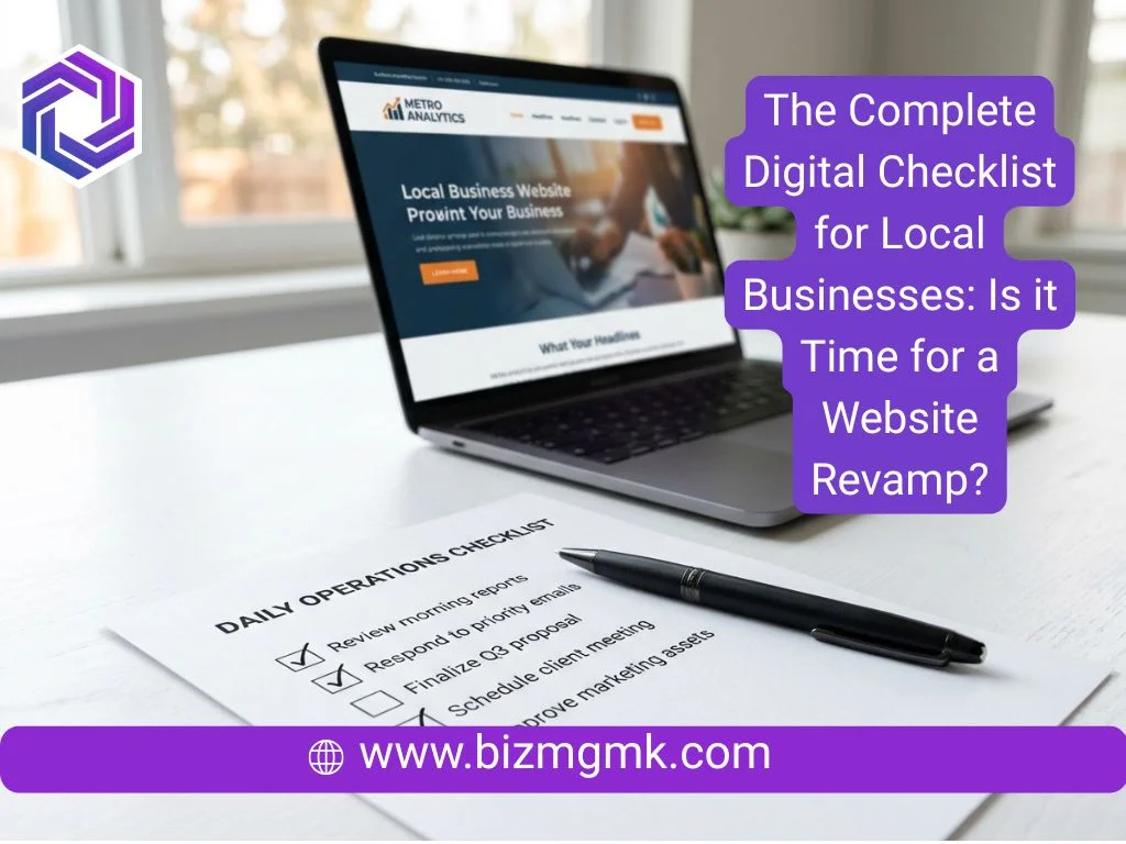
Most law firms, med spas, and clinics have the same problem. The website looks professional. The services are listed. The phone number is there. And yet the phone barely rings from it.
The site isn’t broken. It’s just passive. It sits there and waits for someone to be motivated enough to dig through it and decide to reach out. Most people aren’t that motivated. They need to be led.
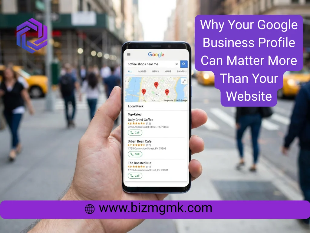
A 24/7 lead machine website that generates leads consistently doesn’t happen by accident. It’s built that way on purpose.
Traffic Is Not the Goal
This is where a lot of businesses get misled. An agency reports that your site got 800 visitors last month. That sounds good. But if none of them called, none of them booked, and none of them filled out a form — what did 800 visitors actually do for you?
Traffic is only useful if something happens when people arrive. The goal isn’t visits. It’s a new client consultation booked, a treatment inquiry submitted, a case evaluation requested. Everything on the site should be pushing toward one of those outcomes.
If you’re getting traffic and no conversions, the site has a conversion problem, not a traffic problem. More SEO or more ad spend won’t fix it.
One Clear Action Per Page
Go to your homepage right now and count how many different things it’s asking a visitor to do.
Call us. Book online. Learn about our services. Meet the team. Read our blog. Follow us on Instagram. Download our guide.
Every option you add splits attention. When someone has six things to choose from, the easiest choice is to choose nothing and leave. The pages that convert best have one primary action — everything else is secondary or removed entirely.
For a law firm, that action is probably “Request a Free Consultation.” For a med spa, it’s “Book Your Appointment” or “Claim Your Free Skin Assessment.” For a clinic, it’s “Book Online” or “Call Now.” Pick one and make it impossible to miss.
That button or link should appear at the top of the page before anyone scrolls. It should reappear in the middle. It should be in the footer. On mobile it should be pinned so it follows the user down the page. This sounds like too much until you look at your competitor who’s doing it and ask yourself why they’re busier than you.
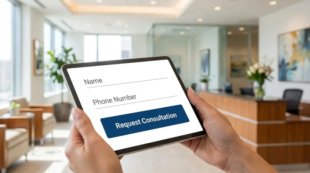
Forms That Don’t Scare People Off
A contact form with eight fields is not a contact form. It’s an interrogation. Name, email, phone, date of birth, insurance provider, preferred appointment time, how did you hear about us, describe your situation in detail — by the fourth field, half your visitors have already closed the tab.
The form’s job is to get someone to raise their hand. That’s all. You can collect the rest of the information when you call them back.
For most law firms, med spas, and clinics, the ideal form has three fields: name, phone number, and one optional message box. That’s it. The lower the friction, the more submissions you get. You can always qualify leads by phone — you can’t call someone who never submitted.
One exception: if your intake genuinely requires more information before you can respond usefully — some legal matters, some clinical assessments — a slightly longer form is fine. But every field you add costs you a percentage of completions. Add fields only when the information is truly necessary before first contact, not because it’s convenient for your intake process.
Click-to-Call and Online Booking
This one is straightforward but ignored constantly.
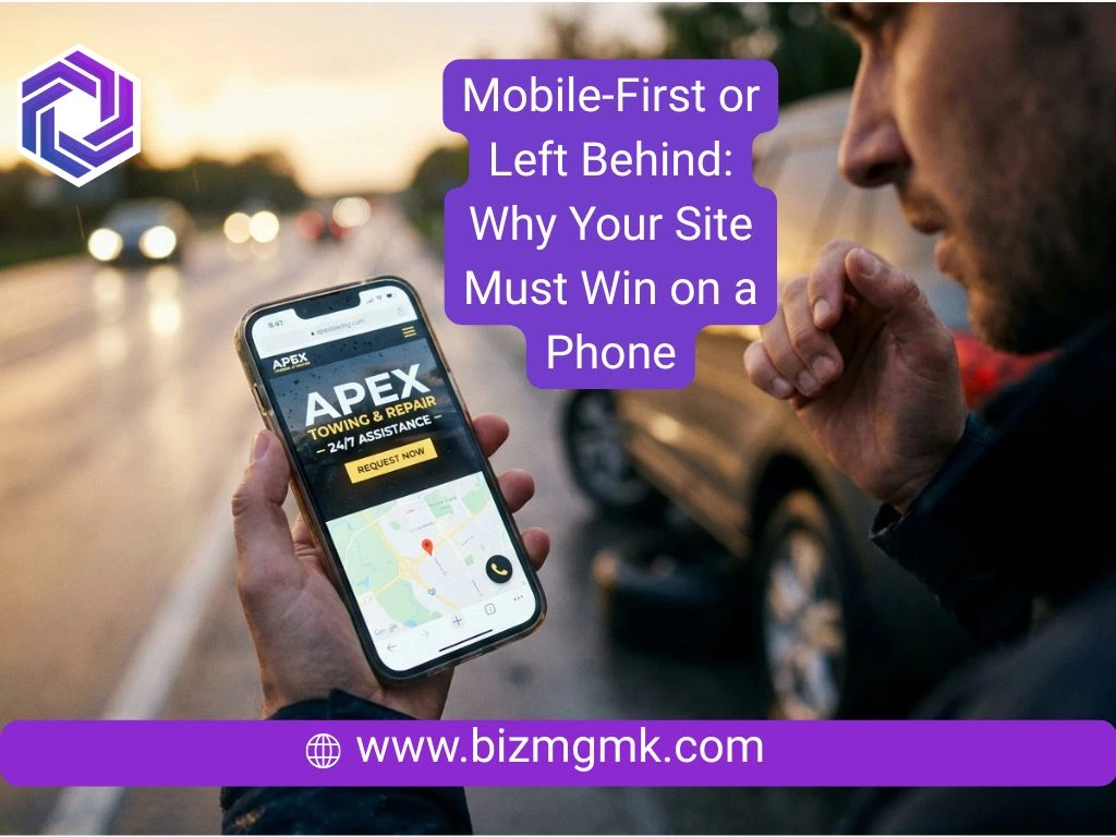
On mobile, your phone number should be a tap-to-call link. Not a number someone has to read, memorize, switch apps, and dial. A tap. One tap and their phone is calling you. If your site doesn’t do this, you’re adding friction at the exact moment someone has decided to contact you.
Online booking is the bigger opportunity. A potential client on your med spa site at 11pm on a Tuesday who wants to book a consultation has two options: fill out a form and wait to hear back, or book directly into your calendar right now. The second option converts at a dramatically higher rate.
Platforms like Calendly, Jane App for clinics, Acuity, and similar tools integrate cleanly into most websites. For law firms, even a simple “schedule a call” booking link — where the prospect picks a 20-minute slot directly — removes the back-and-forth that causes leads to go cold.
If your competitors offer online booking and you don’t, you’re losing the people who decide at 10pm.

Trust Signals That Close the Gap
Someone landing on your website for the first time knows nothing about you. They found you through Google or an ad or a referral. They’re evaluating whether you’re legitimate, whether you’re good at what you do, and whether they’d be comfortable putting themselves in your hands.
That evaluation happens fast, and it’s largely visual and emotional before it’s rational.
For a law firm: attorney photos that look like real people, not stock headshots. Case results or client outcomes where you can publish them. Bar association memberships. Real testimonials with first names and situations, not anonymous five-star quotes.
For a med spa: before-and-after photos of actual patients with their consent. Credentials of the practitioners — nurse injectors, aestheticians, medical directors. Video walkthroughs of the space. Reviews pulled in from Google showing recent, real feedback.
For a clinic: the faces of your doctors and staff on the about page, not hidden behind a generic team section. Insurance panels you accept, listed clearly. Patient testimonials. Certifications and affiliations that patients actually recognize.
None of this is complicated. Most of it is content you already have or could produce in an afternoon. The mistake is burying it — putting credentials in the footer, testimonials on a separate page nobody finds, or staff photos that are thumbnails too small to convey anything.
What to Measure
Most business owners check their Google Analytics once, feel confused, and close it. Here’s what actually matters for a lead-generation site.
Conversion rate: what percentage of visitors take the primary action. For most local service sites, 2–5% is reasonable. Below 1% means something is broken. Above 5% means the site is working well and the priority shifts to getting more traffic.
Form completion rate: if you’re using a form, what percentage of people who start filling it out actually submit it. If this is low, the form is too long or something about it creates hesitation.
Bounce rate on key pages: if people land on your services page and immediately leave, the page isn’t matching what they came looking for — either the content is wrong, it loads too slowly, or the mobile experience is broken.
Phone calls from the site: if your number is clickable, most platforms can track how many times it gets tapped. This is often the primary conversion for trades and clinics and it goes unmeasured constantly.
You don’t need to obsess over analytics. But checking these four numbers once a month tells you whether the site is improving or sitting still.

The Real Cost of a Passive Website
A law firm that books two extra consultations per month from website improvements at an average case value of $3,000 is generating $72,000 per year from changes that cost a fraction of that to implement.
A med spa that captures five more booking inquiries per month from a better form and a booking integration — at $300 average treatment value — adds $18,000 in annual revenue from a single afternoon of work.
A clinic that stops losing the patients who visit the site at night and leave because they couldn’t book — that’s appointments that were already there, just not captured.
The site you have right now is either capturing those people or losing them. There’s no neutral.